
|
The following sections (Web/App page examples indicated by FIG. #s & Titles) illustrate a few of the basics of the USS Web/App viewing and interaction process—though the government may choose to alter certain aspects should it choose to adopt the USS project. Narrative text will be in purple Arial font; links viewers would normally click on are mostly indicated in blue; lines & arrows identifying specific graphics are also in blue; and instructional text viewers would normally see on the site is in black for normal info, green for certain title headings, or red if it is text of a warning or of a critical nature. I may also use other colors, but their purpose will be obvious. |
Page 1 of 12
Next Page
Go to Page
2,
3,
4,
5,
6,
7,
8,
9,
10,
11,
12
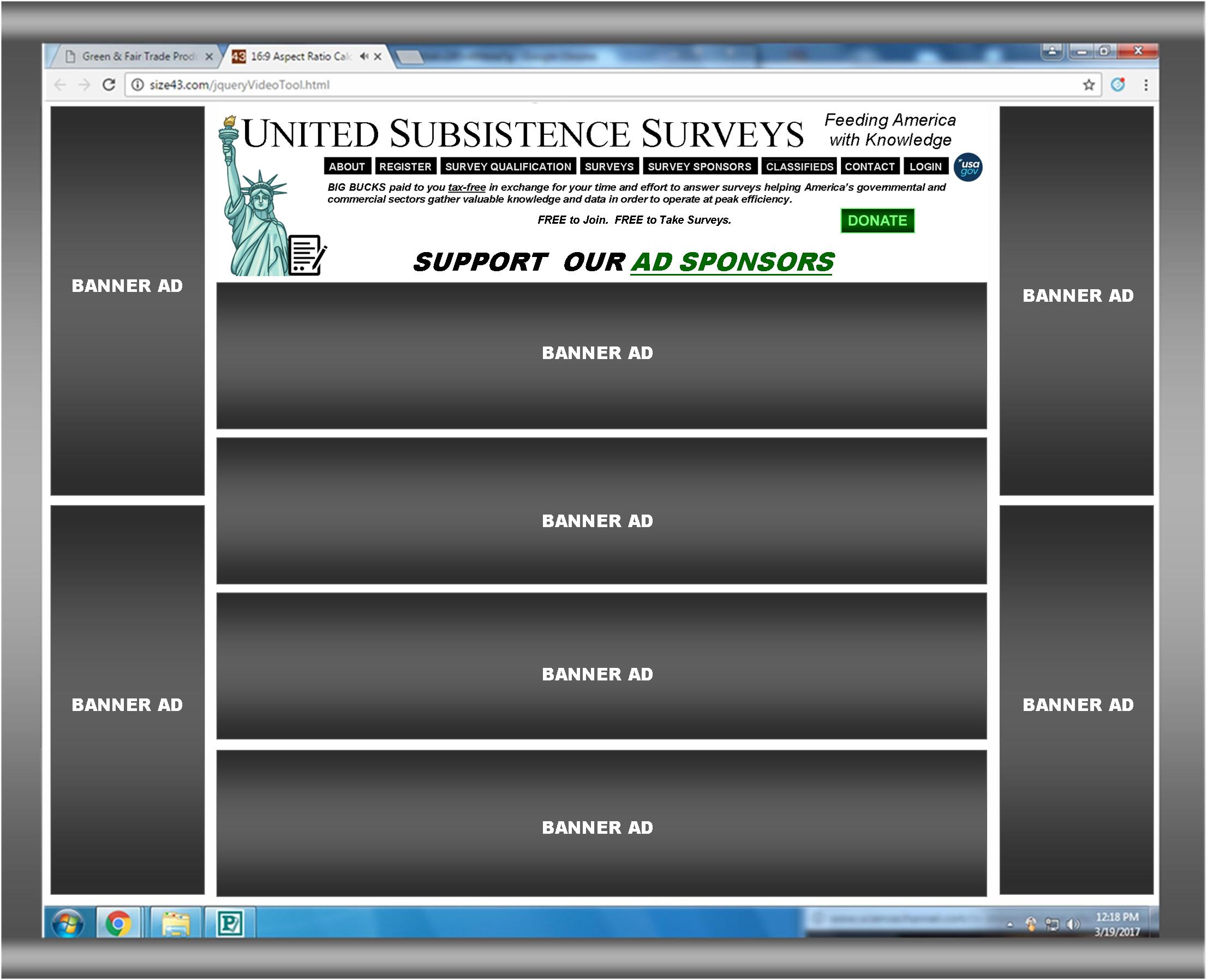
FIG. 1: USS HOME PAGE

|
The above HOME PAGE is gauged via my 19” HP computer monitor. It will consist of the header and links (including the USA.gov link) along with spaces of large banner ads for Ad Sponsors—with said Sponsors paying a premium per period (whether week or month) for a spot, and all banners being linked to the URLs designated by the Ad Sponsors. The DONATE button leads to a page where citizens can donate (tax-deductible) to the USS process.
Clicking the green “AD SPONSORS” leads to the $UPPORT OUR AD SPONSORS page where members can view ads by Advertising Sponsors (FIG. 11). |
Page 1 of 12
Next Page
Go to Page
2,
3,
4,
5,
6,
7,
8,
9,
10,
11,
12